Thank you, Judith Skinner!
This used to be a very tedious process, mixing lump after lump of one color with another, until you had a series of lumps that shaded from one color to another. This way is very easy, once you've tried it
|
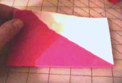
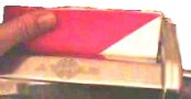
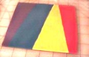
Start with roughly triangular
sheets of clay. I want the deepest shade to be untinted with white, so I have left a strip of
the pink along this left edge into which the white triangle doesn't intrude.
Can you see how this color will remain strong? |
|
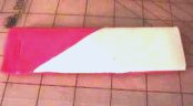
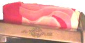
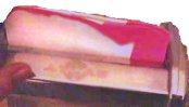
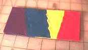
I'm folding the edge farthest from me down
to the edge closest to me, matching up the edges. If I look at the left end, the edges are pink, if I look at the
right end, the edges are white. |
|
|
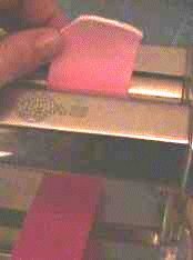
I'll lightly crease the fold and make sure that
the fold is the first part into the pasta machine. |
|
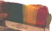
Just keep folding from top to bottom... don't
throw a side - to - side fold in there, or what you get won't be a blended sheet. |
|
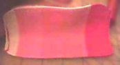
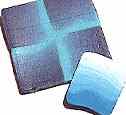
What's going on on the outside is interesting,
but it isn't a smooth blend yet. You can fold this ruffly look to the inside, or exploit it and use it as it is...
it's kind of pretty. |
|
|
|
|
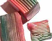
This long belt can be thinned with a lower
setting on the pasta machine. You can roll it up, jellyroll-style from whichever end you wish. You can cut it into
equal widths and stack the pieces, or you can accordion fold the strip to make a blend. |
|
Mike Buesseler's got another way to do blends on his site... keeping the blends narrow can be important to what you're trying to do. |
|
This is one way to lay out colors for a rainbow. The template shows another way. Printable rainbow template here. |
|
The idea is still the same though, fold from top to
bottom, and feed the fold first into the pasta machine, every time. |
|
|
This goes through some really ugly stages. *g* One thing I've found that helps is to use the more translucent colors, like many of the Fimo Soft line. The colors are "truer" than the ones you get from the clays that are densely opaque. |
  |
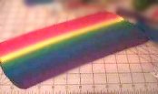
The number of things that you can do with simple
and complex blends is endless. This was my first rainbow project.
|
|
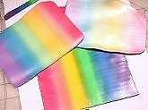
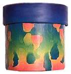
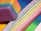
The bright rainbow sheet on the bottom of the stack
consists of six Fimo Soft colors. They are rather translucent in nature, and I've found that they do a good job of tinting
the colorless translucents and some of the pearls.
|
I cut one thin strip from the rainbow blended sheet (about 3/8" wide) and added it to a sheet of translucent clay and
another little strip to a sheet of pearl.
20 trips through the pasta machine later...... |
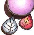
 I'm not
even an "egger," but these really bring spring and Easter eggs to mind.
I'll bet you could at least double the amount of rainbow that I added
without affecting the translucency very much, and get some really jazzy
canes to cover votives with.
I'm not
even an "egger," but these really bring spring and Easter eggs to mind.
I'll bet you could at least double the amount of rainbow that I added
without affecting the translucency very much, and get some really jazzy
canes to cover votives with. |
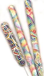 Here's a
needle tool and some pens that I covered with the pearl and with a stronger
mix of translucent colors...
Here's a
needle tool and some pens that I covered with the pearl and with a stronger
mix of translucent colors... still very "clear." |